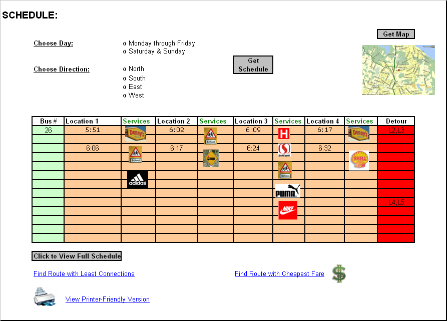
On the Schedule page, the user will first be presented with a title at the top left corner identifying that this is the Schedule page. The “SCHEDULE:” title will be in bold and font 14 to make it clear to the user. This way the user will always know where he/she is navigating by looking at the top left corner. Right under the title the user will be provided with two options. First option is “Choose Day:” where the user will be provided with two choices in the form of radio buttons. The two choices are either to choose from Monday through Friday or Saturday & Sunday. The second option is “Choose Direction:” where the user has a choice between North, South, East or West. The user must once again select one of these by clicking on the radio button. There after the user can click on the “Get Schedule” button which will get the schedule according to the options the user chose. The “Get Schedule” button is placed to the right of the two options. To the right of the “Get Schedule” button, almost at the top right of the page, the user will be provided with a map. The map is minimized and then user must click on the “Get Map” button placed right above the map in order to get a full view of the map.
In the center of the page the user will be
provided with the
desired schedule. First the Bus # will be given to the user. This will
be done
vertical column. The column will be colored light green. The light
green color
has been chosen so the user can distinguish between the bus number
field and
the other fields available. To the right of the “Bus #” field there
will be a
large section providing the user with area locations and times. This
information
will also be provided vertically downwards. Next to each location there
will be
a “Services” field. This field contains icons representing different
services
along the bus route. The user can click on these icons in order to get
further
detail on the service.
The “Services” titles are all colored green.
This
separates the “Services” fields from the “Location” fields and the user
will be
able to distinguish the different between them. The entire field where
the
different locations and services are given is colored with a light tan
color.
Again this is done to separate the fields from each other. To the right
of this
field, there is another field going down vertically. This is a “Detour”
field.
Here the user will be provided with updated information on various
detours
happening in that area. A detour can for example be described by
writing L2, L3,
which means that the route has a detour between location 2 and location
3. The
detour field is colored red. Red is a color that represents
danger/warning and
the idea is to use red as a warning sign to get the detour information
across
to the user. The schedule provided is just a minimized version of the
full
schedule.
In order for the user to view the full
schedule, he/she must click on
the “Click to View Full Schedule” button provided right under the
minimized
schedule. This will take the user to another page with a full view of
the bus schedule.
The user is also provided with three other options right under the
“Click to
View Full Schedule” button. All the options are provided as links.
The first
link is “
Low-fidelity prototype: