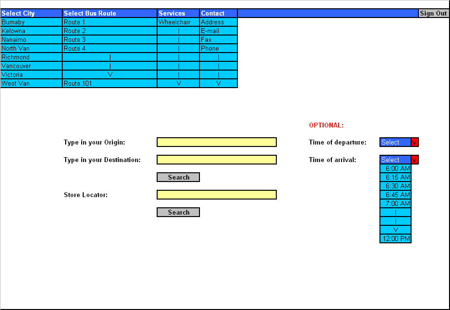
Once the user has created a user profile and signs in, he/she will be taken to the first page of the Bus Mapper. This page will have a menu bar at the top of the page. The menu bar will stretch all across the page horizontally from left to right. The menu bar will have different fields to select from. All the text in the menu bar except for the “Sign Out” part will be written with a white color, since the background color of the menu bar will be blue. The white color will allow the user to read the text in the menu bar with ease. The “Sign Out” text will be colored black since it is a button and its background color is grey.
The first menu will be the “
The second menu will be the “
The third menu will be the “Services” menu.
This menu will
consist of a set of sub-menus. One sub-menu is called “Wheelchair.” The
user
can click on the Wheelchair option and he/she will be redirected to
another
page where more information about wheelchair guidelines is provided for
the
user. The user can go back to the first page from the wheelchair page
by
clicking on the back button provided by the browser (this can be done
for any
of the pages).
The fourth menu will be the “Contact” menu. The Contact menu will consist of a sub-menu of options, starting from top to bottom with Address, E-mail, Fax and Phone respectively (all done in alphabetical order from top to bottom). When the user clicks on each of these options he/she will be redirected to another page containing information on the option chosen. For example, if the user clicks with the mouse on the Phone option, he/she will be taken to another page that provides the user with the phone number of the main transit office.
At the end of the menu bar there will be a
“Sign Out”
button. When the user clicks on the Sign Out button, the system will
sign the
user off and take them to the main page of the Bus Mapper.
In the center of the page, about half way
down the user will
be provided with a search option. There will be a field stating “Type
in your
origin:” in bold and to the right of it there will be an empty field
where the
user can type in their origin with the use of the keyboard. All fields
that are
provided for the user to type information with the use of the keyboard
are all
colored light yellow. This idea is kept consistent throughout the
entire Bus
Mapper system. Under where it states “Type in your origin:” there will
be another
field stating “Type in your destination:” in bold. To the right of it
there
will be an empty field where the user can type in their destination
address
with the use of the keyboard. Right under this field there will be a
search
button that the user can click on in order to get the results on the
information they require.
A little further down the search button
there will be a field
which states “Store Locator:” in bold and to the right of it there will
be an
empty field where the user can type in the name of a store and click on
the
search button right under it to locate the chosen store.
As an optional choice, the user will be provided with a “Time of departure:” in bold, which will be placed in the middle right of the page. Here the user can click on a menu bar and a list of times will appear as a sub-menu and the user can select with the mouse a specific time they require for departure. Right under the “Time of departure: field the user will be provided with a “Time of arrival:” in bold. Here the user can click on a menu bar and a list of times will appear as a sub-menu and the user can select with the mouse a specific time they require for arrival. This is an optional choice for the user. The times displayed in the sub-menus will start (top) from 6:00 am to 12:00 pm (bottom of the list).
The background of the entire page will be white in order to avoid confusion and invite simplicity to the user. The menus will be colored blue, with the sub-menus in sky blue color. Most of the text on the page will be presented in black except for the “OPTIONAL” text which will be in red, bold and capital letters to catch the user’s attention that this field is optional. The menu titles are written in white. All buttons will have a grey background color.
Low-fidelity prototype: