Menu Items
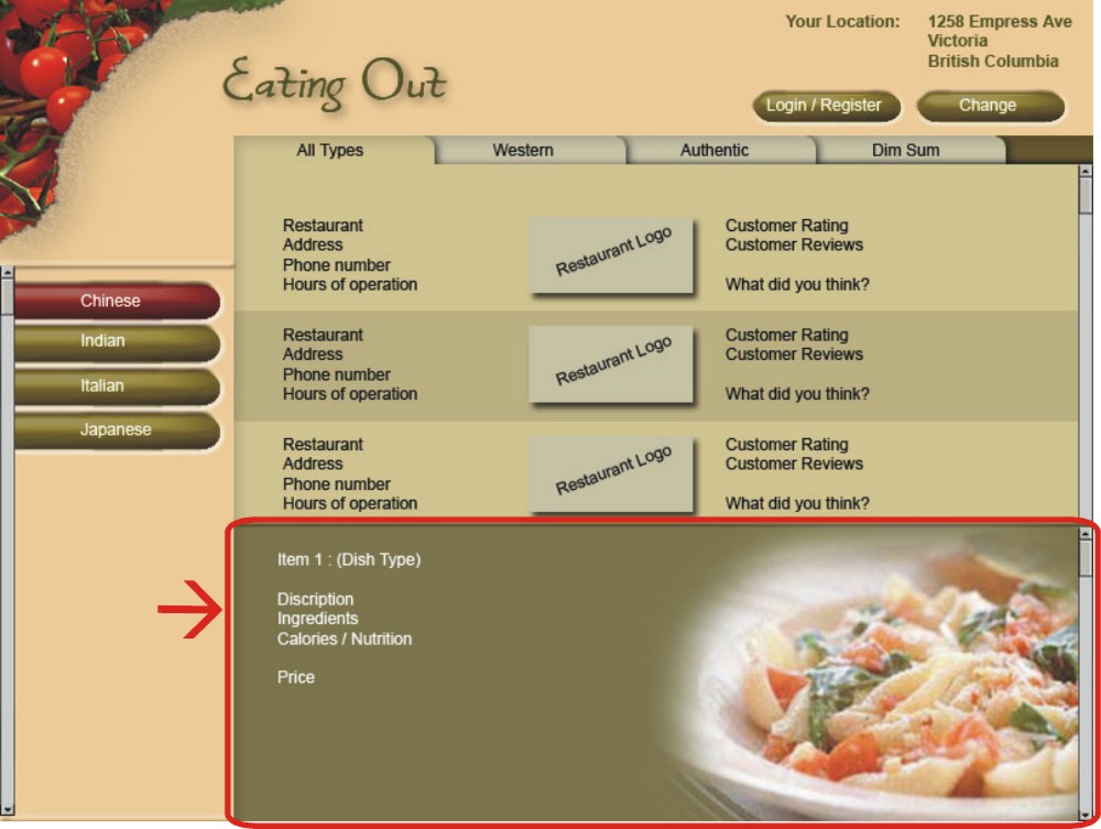
Here the details of the menu items can be viewed using a scroll bar. There are five push buttons used to indicate the item name, description, ingredients used, calories, and price. Each of these items is linked to the relevant details in the database. Upon selecting any menu item from the menu list, a sample picture of the dish is shown on the right side of this window. The 'click for location' push button is linked to 'mapquest' website which displays a location map with driving directions to the restaurant.
Fonts
‘Arial 12 point’ font is used for most of the textual part in the menus, buttons and tabs. A bigger font size of 24 is used for the heading.
However, to maintain the consistency, all the main cuisine type headings can be given in one size, and sub-types of cuisines in slightly smaller size than main cuisine type.
The normal text can be formatted in one size to visualize the website details clearly. The preferred fonts are ‘Arial’, ‘Verdana’ or ‘Helvetica’.
Colors
To maintain the consistency and aesthetic appealing, a few specifically chosen colours are used.
Beige is used as background for this website.
The display window showing the restaurant details is in light green, and the menu item display window is in dark green to make the graphics attractive.
All the scroll bars are in grey colour.
All the ‘Push buttons’ are in different shades of green to match with the background window colour.
The text colours (white, green, and black) are used according to the background of its objects.