Project Phase II: Design for Student Organizer - SO
SO (stands for Student Organizer) is a software application that helps student to organize their activities. The design is solely based on requirement analysis from Group2_02 regardless whether the requirement analysis fully supports ideal functionalities that are supposed to be in SO - i.e. we do not add additional requirements by ourselves to design better application but limit to what have been provided by requirement analysis. We developed an executable low-fidelity model and captured screenshot to explain in detail how our design meets the requirement analysis.
Contributor : Group2_01(0235387, 9807372, sreynen)
Overview of the design of Student Organizer
Our design uses commanding concept models. Most of the functions are executed by users' command (e.g. adding course, removing course, adding task, viewing to-do lists, etc). There is no interface metaphor we used - as a matter of fact, we thought about the meeting scheduling program in the MS Outlook Express as adding a meeting in the schedule program is analogous as adding courses in the SO, and both meetings and assignments/exams are time event ;however, it became very irrelevant as we followed the requirement analysis.
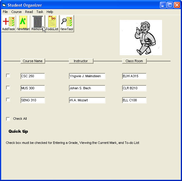
SO starts by showing spreadsheet-like table at the main window. At the top, there are four main menus each of which has pull down submenus. And here is the captured screen shot from the low-fidelity model:
SO is comprised of four top menus all of which have pull down menus as following (R indicates the requirement numbers from the requirement analysis):
File categorizes user commands for processing/retrieving files or application
Course categorizes user commands related to specific courses
Read is able to pull the assignment or exam information of the specified course by user from main database, which maintains up to date information for every course provided - includes the courses that users are currently taking.
Task categorizes activities related to users' assignments and exams schedule - e.g. adding new assignment and due date by "Add New Task", generating the list containing exams and their dates in specified time span by users (2 weeks by default) by "Generate To-do List", changing time span by "Change the Range of To-do List", etc. One peculiar submenu under "Task" is a "Task Name", which is not clearly documented in the requirement analysis. Read "Ambiguity from Requirement Analysis" section for more detail.
Shortcut commands are provided and executed by pressing and holding Ctrl first, and then pressing the underlined key as shown below.
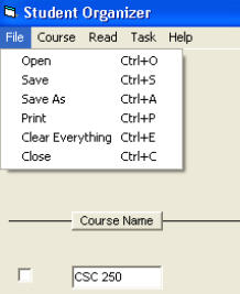
The arrangement of menus follows convention (putting "Close" at the bottom of the first main menu) and avoids the adjacency of "Save" and "Remove" throughout all submenus to minimize probable error.
Note :
Specific command interface design of Student Organizer
1. File
1.1. Open
When users click on "Open" (or command by shortcut), window pops up common dialogue box showing directories and files that are readable by SO. The readable file format is "so" - e.g. my_schedule.so
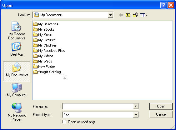
As shown above, file type specifically sets to "*.so", which helps users to see only available file format.
1.2. Save As
"Save As" also have similar way of showing directories and files with "*.so" setting users to available file format without typing it.
1.3. Print
"Print" also pops up window showing available printers in local or through networks for printing. Print is capable of printing "To-do List". Users need to check the relevant courses first, generate to-do list and then click on "Print" in order to print their to-do lists (HTA-R10).
1.4. Clear Everything (HTA-R14)
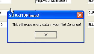
"Clear Everything" pops up confirmation window asking for confirmation upon user command, which is specified in the requirement analysis and implemented in the low-fidelity model as shown below.
2. Course
2.1. Add Course
There is no menu for adding a course as in requirement analysis as shown below:
HTA for R2:
There exists no buttons or menus according to the HTA for adding courses. Instead of extra button for adding course, users can double click the column under "Course Name" in the spreadsheet-like table in the main window of the application. And then click on "Save" to save it. This is implemented in the low-fidelity model.
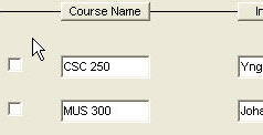
Users can enter their courses under course name column along with instructor name and class room number. To add courses, users just have to push the button, "Course Name". When the button is pushed, new columns will be created under "Course Name", "Instructor" and "Class Room". Then users click on the text boxes to enter their course names. As buttons afford pushing, with little or no instruction, users can figure out how to add their courses in SO.
2.2. Remove Course
The check box is very useful to many user activities. One of them is for removing courses. Users check the box right next to the course that they want to remove and click (or by shortcut) on "Remove Course" under top menu, "Course" - this is the way described in the requirement analysis (HTA-R3).
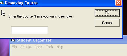
The other way of removing courses is by prompt. Users click on "Remove Course". Then window pops up asking for the course that they want to remove as shown below.
2.3. View the Current Mark (HTA-R8)
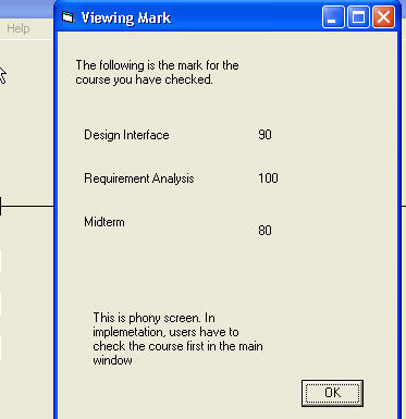
To view the current mark, users again select the courses by checking the check box first and click on Course->View the Current Mark. Also, there is a "check all" check box provided at the main window so that users can see the marks from all of their courses when checked. This meets the requirement analysis as well as it does more.
3. Read (HTA-R4)
3.1. Read Assignment
"Read" pops up window asking for specific course name that users want to see assignments and exams from. When "Assignment" is selected, small box prompts asking specific course name with input text box. As SO will not maintain the database storing all courses' information in the education institute - it's wasteful, and one of requirement for SO is not to take enormous amount of memory in the users' computer, it will connect to main database to pull out the information. In the web format of SO, "Read" interface design will somewhat look like this:
By clicking on "Submit", the application will connect to the main database, which maintains up-to-date information from all courses, and generate the list of assignments along with related information for the courses. The list will contain the information about due dates and percentage weight of the assignments in the web form as following:
| Course Name | Assignment | Due Date | Percentage |
| SENG 310 | Interface Design | May 21, 2005 | 10% |
| SENG 310 | Interface Implementation | June 21, 2005 | 10% |
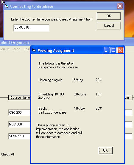
In our low-fidelity model where the list of window can be resized, shrunk, full-sized, minimized, users enter course name in the prompted window first. Clicking "OK" button will connect to database, pull the information, list the results in new window:
3.2. Read Exam
For reading exam, same interface design is used in the low-fidelity model (consistency). You can play with the executable file provided and see it for yourself.
3.1 and 3.2 meet HTA-R4 in the requirement analysis.
4. Task
4.1. Add New Task (HTA-R5)
Our design meets HTA-R5 in the requirement analysis in two different forms - web form and software.
Add New Task in the requirement analysis asks users with too many prompted boxes, which might be annoying. In the web form, the series of prompted boxes will resemble followings:
Say, you put my_task_assignment in Task Name. Clicking on Select button will prompt another box as shown in requirement analysis:
Say you put 25/May/2005 in Due Date. Clicking on Select button will prompt another box as shown in requirement analysis:
We are not sure what requirement analysis meant by "Entering the Value". Clicking on "Save" will save it in users' to-do lists.
As shown, it utilizes many prompted boxes without reasonable explanation. Our fidelity model made compromise by asking all questions at one time so as not to bother users with series of questions:
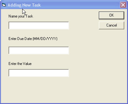
By clicking "OK", the information will be added into users' to-do lists.
Note:
4.2. Change the Range of To-do List (HTA-R11)
It is very intuitive. Users need no instruction as most of other functions provided in SO. By clicking on the combo box, users can change the range of to-do list from 1 week to 4 month.
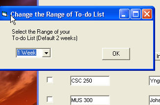
4.3. Generate To-do List
To-do List contains the related course name, and the due date and subject of what needs to be done in the range of to-do list (e.g. in 2 weeks. This is in conjunction with 4.2). To be able to see their to-do lists, users need to select the related courses first. And this meets the HTA-R6 and HTA-R15 in the requirement analysis. For HTA-R6, users can check "check all" check box - no need for checking individual courses one by one.
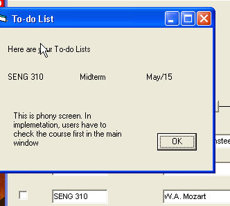
4.4. Task Name
This might be the most ambiguous issue from the requirement analysis.
HTA for R7:
3: enter the gradeIt is not known what the task name is in 3.2. Is the task name "enter a grade"? The task name from the task list has only one sub-menu - "enter a grade" throughout all other HTAs; however, we leave this as it is, instead of making assumption that the task name might be "enter a grade".
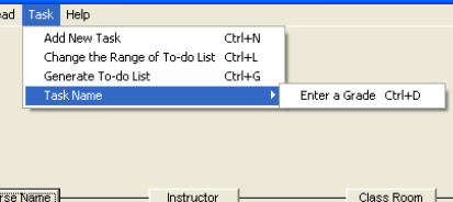
Following the requirement analysis, "Task Name" is under "Task" list and the Task Name has lower submenu, "Enter a Grade". It is possible that "Enter a Grade" is in somewhere else, which is not specified in the document. As it is reasonable to think Enter a Grade as one of Tasks, we implemented that way. Users need to select course first in order to change their grade pertinent to the course. After clicking on it, a window pops up asking for user input:
Upon clicking "Enter a Grade", a window prompts asking for
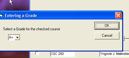
Users can select from the range of A to F in the combo box. Updating current mark as in HTA-R9 also executed in this way by entering a grade after selecting the related course.
Additions
Here we want to discuss briefly about what would facilitate more user-centered approach or what has been added for accomplishing such an approach beyond what the requirement analysis has covered. Because the following items are not mentioned in the requirement analysis, we did not build such a prototype (low-fidelity model) that preferably reflects the most of the following items - there are none usability and user experience goals specified in the requirement analysis.
For example, the screen above will have the column name reading from left to right at the top - Course Name, Task Name and Due Date, all of which are implemented in the button form so that when users click on the button, the screen will sort by that button (e.g. course name button will sort lists in alphabetical order of the courses).